Unbreakable, Part II: Motifs and colour
This article is part of an analysis project about M. Night Shyamalan‘s five films from 1999 to 2006: The Sixth Sense (1999), Unbreakable (2000), Signs (2002), The Village (2004) and Lady in the Water (2006). This is the second article about Unbreakable. The first is here, the third here. The articles about the other films can be found in this overview.
These three articles are the result of a close reading of M. Night Shyamalan‘s 2000 film Unbreakable. The main focus here is the finer details of the film, with an emphasis on how various elements of the film interconnect. I will always try to suggest how the details could reflect the film’s meaning. Sometimes, however, one has to remain satisfied that details form patterns that are “merely” a device for creating order and coherence in the work. To a large extent, a close reading is a pattern recognition process, and an analyst must go where the data lead, whether that place is “meaningful” or not.
This article will explore the film’s motifs: high and low culture, numbers, the visual motifs of arches and staircases, as well as the train scene and the motifs emanating from that. It will also consider some other forms of coherence in the film. The article will then explore the use of colour as motifs. That section ends with a thorough analysis of the stadium sequence, in which the colour blue plays an obsessive role. The analysis will sweep up the other, already-discussed motifs that occur in this sequence, to give an impression of how all the motifs are acting in concert. An addendum will shed light on a scene mysteriously obsessed with orange juice.
In order to discuss the film properly, I will eventually have to reveal the whole plot, including the major plot twist at the end, for both Unbreakable and The Sixth Sense.
For readers unfamiliar with the story of Unbreakable, here is a brief outline of the plot.
The high and the low
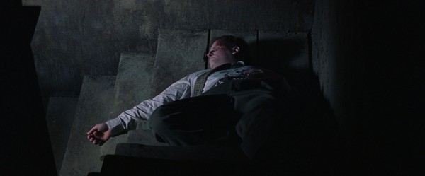
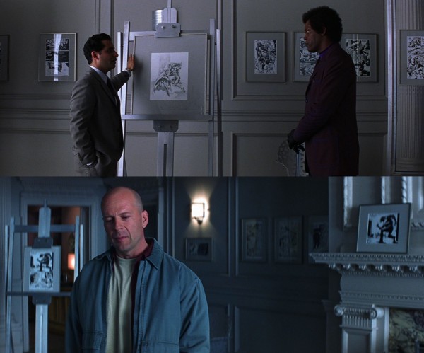
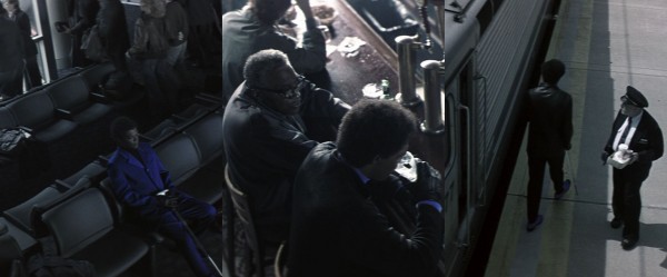
It is hard to imagine a more jolting culture gap in just one cut, from the scene in the gaudy comic book store of Elijah to the classy bar of David and Audrey. Joined together, as above, the images look like some kind of absurd pop art statement, cutting from low to high art. (The “painting” in the background, which is actually “Dream Garden”, a famous glass mosaic designed by Maxfield Parrish, in Philadelphia’s Curtis Publishing Building, whose lobby were converted into a bar for Unbreakable.) There is great contrast in music as well: in the shop a rough rock song, The Pixies‘ “I’ve Been Tired” (its lyrics could be applicable to David’s relationships to both Elijah and Audrey); in the bar the melancholy, soft jazz song “Lotus Blossom”, composed by Billy Strayhorn for Duke Ellington. (The very different personalities of these two and the intensity of their decades-long work relationship may reflect the connection between David and Elijah.)
Such a relationship between the high and the low is an important Unbreakable motif. In both the first gallery scene and the exhibition scene, the “low” comic book art is accompanied by Bach, played by Glenn Gould to make it extra classy. In the first scene the sophistication of Bach also contrasts with the simplicity of the film music (based on a five-note motif) when Elijah discovers comic books in the scene just before, which even dissolves into the next one, underlining how Elijah has grown. Metaphorically, he has elevated “five-note” comic books to Bach-like works of art. Musical juxtaposition – sweeping orchestral music fused with motoric trip hop-like rhythms – also occurs in the opening credits music, the film’s main theme which later shall reach a hypnotic crescendo in the train station sequence.
As another example of how Unbreakable seems to be worked through in minute detail, the TV shows between which Joseph is zapping in his first scene are hardly unconnected to the film (images have been flipped since Joseph is watching TV upside down):

Besides being deliciously absurd, this clip from the Jerry Springer Show reflects the high-and-low motif, Elijah’s eccentric clothing, the colour of his skin and, most of all, his desire to elevate comic books from “trashy to classy”. Furthermore, the girl on the left claims that someone has failed to realise something. This ties in with the next clip:
This is from The Powerpuff Girls. By being drawn and about superheroes the show nicely connects to Unbreakable themes. This clip, too, is about someone having failed to realise something, in this case that the normal-looking girl can suddenly turn into a belligerent character who lashes out, super-fast, at her surroundings. This has all to do, of course, with the fact that David fails to realise Elijah’s secret designs, is in denial about his own superpowers, but will finally use them. (The third show, less important since we only hear it, is I Am Weasel, another cartoon, built around the bitter antagonism between two characters.)
The numbers motif
Before the first photographic image in the film, we are presented with the above text card. (Apparently, some of these statistics are taken from “Comic Books: How the Industry Works”, written by Shirrel Rhoades.) Certainly, putting comic books in perspective is useful, and the dryness of the figures connect the colourful world of superheroes to a real world, which is important to the film. This statistical approach seems strangely disconnected from the rest of the film, however, and serves the double function of establishing the numbers motif in an unobtrusive way. Numbers and enumerations are, quite simply, heavily over-represented in the film.
This has probably to do with the iconic nature of numbers in the superhero comic world. Issues of a title are numbered cumulatively over the years, with landmark events on the way bestowing fame on seemingly random numbers. Batman first appears in Detective Comics #27, The Legion of Superheroes in Adventure Comics #247, Dr. Strange in Strange Tales #110 (without even making the cover!) and so on.
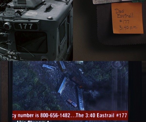
There are two iconic comic books in Unbreakable. It is hard to make out the number of the Active Comics issue, but it could be #273. (The logo closely mimics Action Comics #1, and when it is initially shown upside down, here, any comics-savvy viewer will think it is that title, yet another instance of things being not what they seem in this film.) But the Sentryman issue is clearly #117, which closely echoes Eastrail #177, the line number of the train that derails. This number is mentioned several times and also appears visually:
The number is heavily foregrounded in the shot from the revelation scene (top left), as if emphasising its iconic nature. So both comic book issues and train lines are identified by numbers, and then it becomes interesting that Elijah’s important comic books are first shown upside down and the first part of the TV news footage as well – the latter due to being Joseph’s point-of-view as he lies upside-down on the sofa. Note also that the line number does not appear on the red banner until Joseph has turned into an upright position, which echoes how the covers, including the numbers, are not clear to Elijah until he has turned around the comic books.
Furthermore on the TV, a phone number is supplied, which adds to the film’s general numbers saturation. The channel is given only as a “4” (this video points out its likeness to the Fantastic Four logo). And on the note it seems superfluous to mention the number, surely the arrival time would have been enough? This very superfluousness is a highly evident technique in the dialogue, and its obsessive specificity becomes almost comical when one becomes aware of it. Just a few of the many examples:
- “You could’ve done one of 10,000 things.”
- “Like if there ever was a fire on floors one, two or three…”
- “I’m meeting this player from Temple University. He’s a cornerback. This kid is 6’1 “, 210 pounds. He runs a 40 in 4.3 seconds. He’s gonna be a god.”
- “A 737 crashes on takeoff: 172 die, no survivors. A hotel fire downtown: 211 die, no survivors. An Eastrail train derails 7 1/2 miles outside the city: 131 die, one survivor.”
- “Fracture of the fifth metacarpal of the right hand, as well as multiple fractures of the sixth, seventh and eighth ribs. The worst of the injury, however, was sustained to the right leg. There were 14 breaks. It simply shattered. (…) Pins were placed throughout the length of the leg. The use of a wheelchair will be needed for a two-month period. The use of crutches will follow for 12 to 14 months. Hospital stay will range from five to eight days, followed by 9 to 12 months of physical therapy.”
This last monologue comes just after a scene where it is constantly discussed how many pounds David is weightlifting – the triumph of those numbers contrasts bitterly with the enumeration of Elijah’s fractures – and in the next scene in the physical therapy centre, Audrey is told that her next appointment is coming up: “Your, uh, 10:00 is here.” The centre is called “Care One”, and the name becomes intensely fetichised as a byproduct of the slow track-in on Audrey that starts this scene:

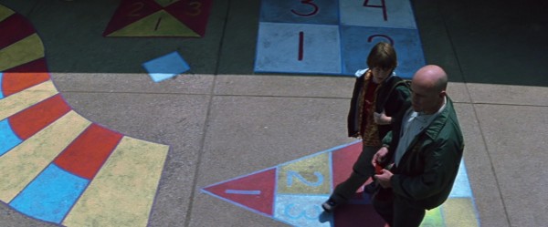
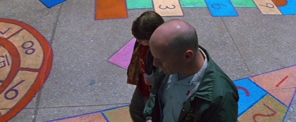
Visually, the numbers motif is doubtless taken to its craziest lengths in this scene:

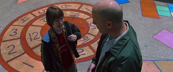
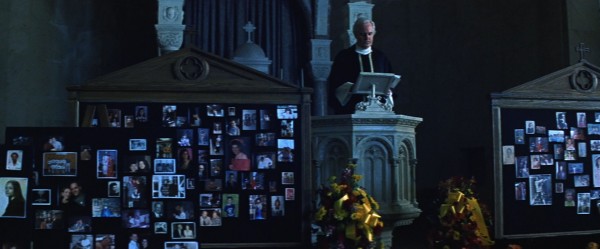
Another motif connected to comic books is a seeming abundance of squares and rectangles. This is nothing I will insist on because it is not over-represented in the same way as the numbers and is not applied with the same artificial undercurrent, encouraging meaning. But since there can be no doubt that many shots of the film were composed as to resemble comic book panels, by frames-within-frames or by blocking out a lot of the shot leaving just a fraction of the image to carry the action – for example in the train scene, here and even more here – it becomes tempting to make something of it. Like above, the note on the wall, the rectangular TV screen, the train window could be said to resemble comic book panels, although it is hard to know when this descends into meaninglessness, because it is impossible to make films without allowing such shapes in the shots. Better luck perhaps with the rectangular windows in the train station (because they appear stylised) or the rectangular covers (antimacassars) on the train seat backs (because heavily foregrounded) or the coloured squares on the floor of the therapy centre. The following shot may also be interesting, from the church service in memory of the train accident victims, due to amassment of squares and rectangles:
The arch motif

Turning to motifs of a visual nature, the most widespread is the arch (or arc-shaped object). In the church service its presence is a natural part of the surroundings (also as arches within arches behind the priest). In addition to visual elegance and grace, this ancient shape lends a sense of timelessness to Unbreakable, befitting Elijah’s line: “I believe comics are our last link to an ancient way of passing on history. The Egyptians drew on walls. Countries all over the world still pass on knowledge through pictorial forms. I believe comics are a form of history that someone somewhere felt or experienced.” (Elijah’s old-style car is another element from an earlier age that co-exists with our present.)

Timelessness was an important motif in The Sixth Sense, arches as well in a milder form. It is also tempting to connect the arch motif to Bruce Willis‘s domed, shaven head (below) and also the shape of his head with the hood of his “superhero outfit” on, somehow turning the film’s surrounding into a psychic landscape, manifesting his inner state. The same goes for Elijah, since the use of arches, and arc-shaped objects, are the strongest in connection with these main characters’ houses and actions. “We’re on the same curve,” Elijah says, at exactly a point where David is standing framed by an arch-shaped doorway. Let us have a look at some examples of the arch motif.

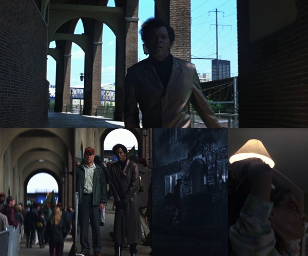

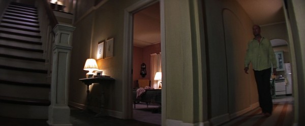
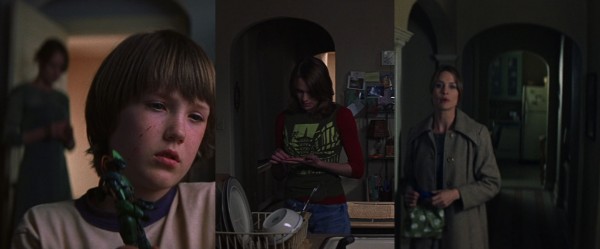
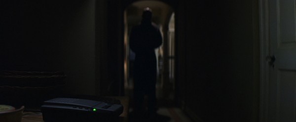


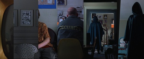
Other important arches shots (which we will return to) are the stadium and the train station. The stadium is brimming with arches and the decision to use Franklin Field as a location might have been a factor in adopting the arch motif for the entire film.
There is a lot of talk about turning points in the art of storytelling, and a few situations in Unbreakable might be taken as humorous (but probably unintentional?) comments on this. Here the characters are actually turning around during the turning point, and always in connection with arches.

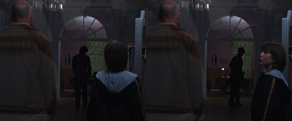
The staircase motif
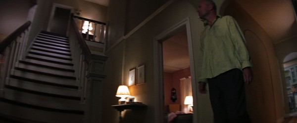
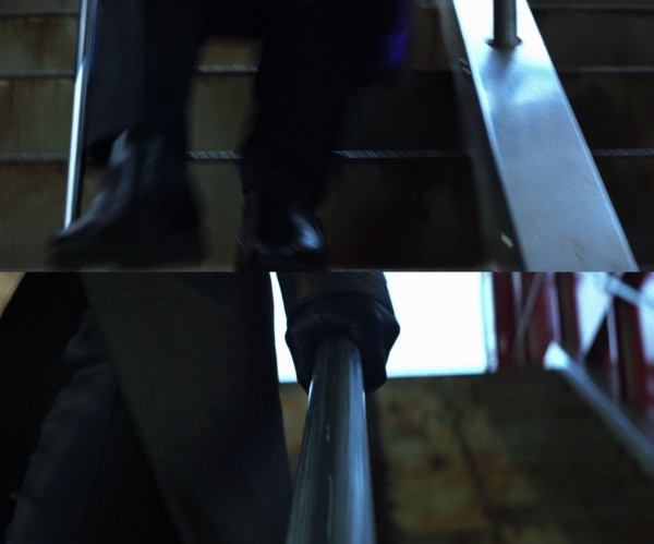
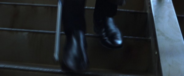
Staircases are a traditional symbol in films, indicating differing levels (of existence) and the possibility of transition between them. In The Sixth Sense, the existential dimension is overt: a staircase up to the bedroom where the hero is shot, a staircase down to the cellar to which he is “banished”. In Unbreakable staircases are also an important metaphor for the separation between David and Audrey, since they sleep on different floors. (Actually it is unclear whether the main reason for this is their marital difficulties or whether Joseph’s psychological problems require him to sleep together with his father.) In the first article, we looked at how the staircase was important in their reconciliation (and between David and Joseph) and also at how the small “staircase” in Elijah’s inner office could represent separation. Here are some more examples of the staircase motif.
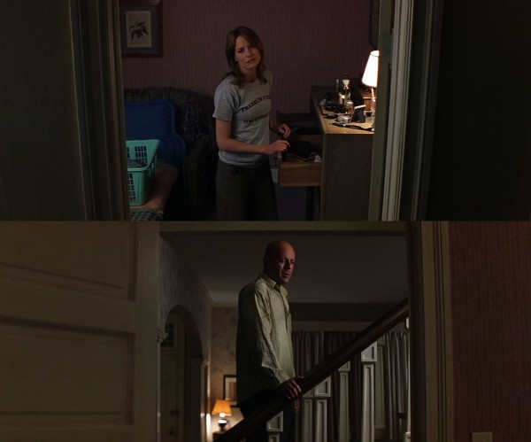

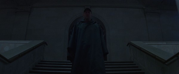


Many of these staircase shots come across as geometrical images with lines of perspective stretching out in majestic fashion, often in the form of railings. Such shots are visually related to another motif of corridors or passages. This type of shots may of course visualise the journey David has to take to finally accept his purpose, and the abundance of them the arduousness of that road.


The train scene
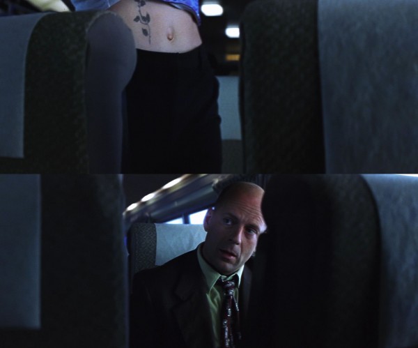
The train scene is distinctive in many ways. There is resonance: the derailment, killing everyone on board except David, happens immediately after his big humiliation, when an attempt to seduce the pretty young woman beside him only results in an awkward mess – it is as if, on some level, the disaster is David’s revenge on the world. There is paradox: the scene presents him as deeply depressed – a state we will learn is rooted in his denial of his superpowers – but he will be the sole survivor precisely because of those superpowers. There is subtlety: the ordinariness of the woman’s question before she sits down, “Are you alone?”, hides a precision-point description of his state of utter loneliness. There is Shyamalan’s trademark of local, short-term foreshadowing: when David rubs his eye to announce to us his tired dejection, it has the added function of showing us his wedding ring (below image), which will be important to the scene. The pauses in the dialogue, while entirely natural, is elegantly used to portion out the film’s credits. By far the most distinctive feature, however, is the fact that the scene is primarily shot in a 3 minutes 49 seconds continuous take where the two characters are only shown through the space between the seats, with the seats at times blocking out most of the image:
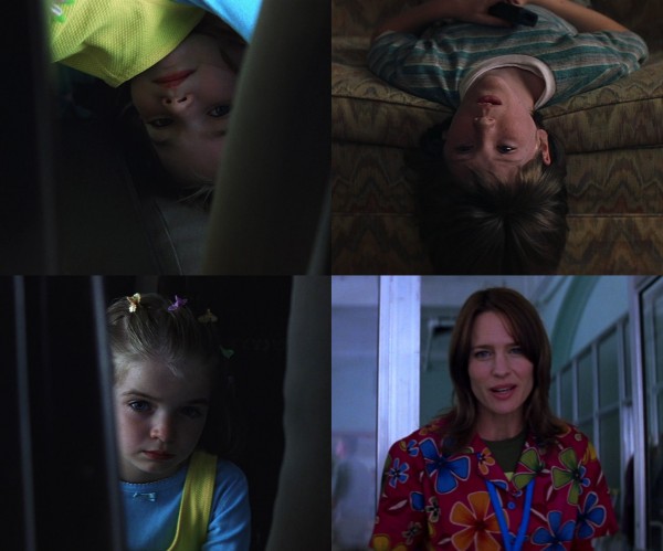
Amidst all this audacity, Shyamalan has added an element that is tantalising in all its symbolic range and ramifications. There is a sweet little girl in the seat in front of them. On a very down-to-earth level, she provides a rationale for the strange way the scene is filmed, in that we could imagine that everything in the shot is seen from her point-of-view as she is changing positions to peer at each of them. On a level of resonance, her presence adds to that of the young woman in changing the tone of the scene on repeated viewings, as they both are occupied with everyday things but will be obliterated in seconds. On a symbolic level, however, she creates connections to both Joseph and Audrey:
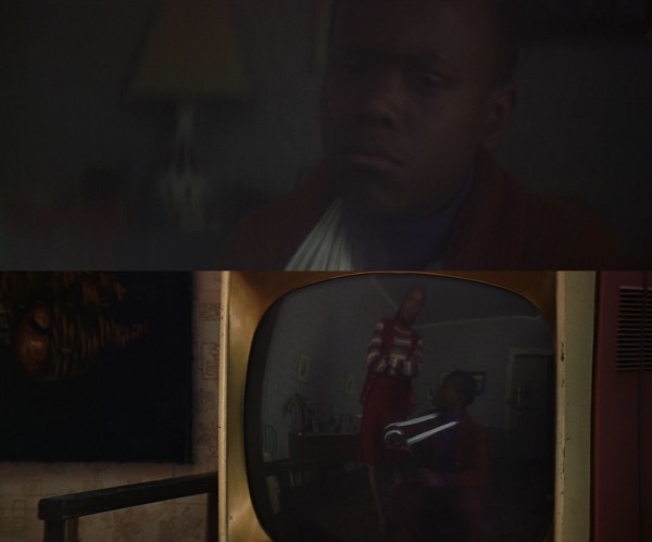
Not only is both Joseph and the girl introduced up-side down, but both are watching a spectacle: respectively TV shows and the real-life human folly playing out in the next seat. The girl is dressed very colourfully (yellow, blue, a glimpse of green), a look that is underlined by her band of many-coloured hairpins, like a rainbow around her head. This connects her to Audrey, who in the physical therapy centre scene is wearing a remarkably colourful outfit. The hairpins (shaped as butterflies?) has also a similar look to Audrey’s many-coloured flowers. Additionally, both are involved in accidents (train, car) with bad consequences (death, injury), while David will emerge unscathed from both accidents. Later, these two “accident strands” converge when David examines the train wreck, which leads directly to the flashback of the car accident.
Why is this connection important? Since it is David’s sense of inadequacy that makes him distance himself from his family, it makes metaphorical sense that both Joseph and Audrey should “observe”, through the symbolic device of the little girl, this moment of humiliation. Especially telling is the glance exchanged between David and the girl after David has put his ring back on: her serious, almost reproachful look at the sordidness and transparency of David’s “trick” of pretending to be unmarried fits very nicely with her being a stand-in for Audrey.
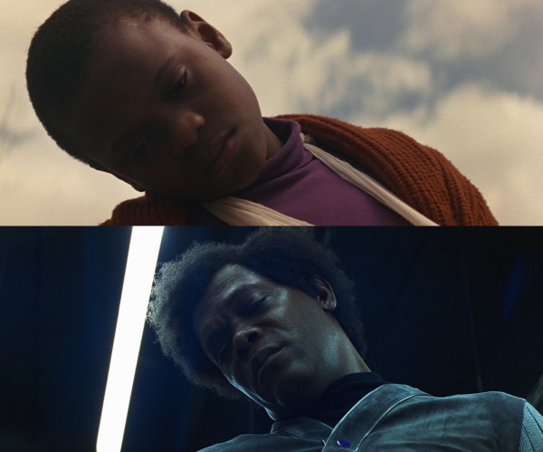
One could even say that she is connected to Elijah. She is a small child appearing immediately after the opening scene where Elijah is born. One of the hairpins is purple, the all-important colour connected to him, representing a faint trace of the purple that dominated the opening scene. Considering the coming bond between Elijah and David, it makes perfect sense that “Elijah” should be observing David on this pivotal train journey. Also, since the girl and Audrey are connected through their colourfulness, it is rather ingenuous that in the very scene that represents Audrey’s end of the connection, at the physical therapy centre, she is meeting – Elijah. (The girl is also connected to the babysitter, who has two small purple items on her back, which we are clearly intended to see as the camera lingers on her while she leaves the house.)
A convincing case could also be made that the girl represents something even more abstract. She seems strangely disconnected from everything else: there is no trace of any parents, and she appears in just two shots, both from David’s point-of-view, as if it is only he who can see her. He seems to become aware of her because she is faintly humming the main theme of the film music, as if it is the film itself that is calling out to him. How on Earth can this child know music specifically composed for the film? This meta level primes her as a metaphor. In this reading she becomes a metaphor for Unbreakable itself, an abstract counterpoint to the down-to-earth reading above – the long take is not from the point-of-view of a child of flesh and blood; she instead represents the gaze of the camera. Furthermore, characters being shown upside-down is a motif in the film, so in this meta reading is it is interesting that she, representing the film itself, is introducing this device.
The girl’s colourfulness is also turning her into a metaphor for comic books, which are known for their gaudy covers. In this respect it is interesting to follow a number of patterns that radiate from the train scene.
When David sees the girl, standing on her head, he tilts his head:
This connects to two other occurrences where Elijah is doing the same:
In all three cases, this is what they are looking at:
The second time David looks at the girl, and when Elijah has turned the comic books around, we get this result:
This is the last wee see of the girl and the comic books in the film. All this uniformity is certainly reinforcing the notion that the girl is a metaphor for comic books. Note how the purple hairpin is echoed in the various shades of purple on the first comic as well as the wrapping, and in the leader of The Coalition of Evil in the second one. Also note how the placement of the comics is always tilted and how this echoes the tilting of the characters’ heads. The piece of original cover art for Elijah’s first comic book in his gallery is also tilted, but the other way. (As testament to the importance of this tilting, the third article shows how camera movement ensures that Elijah’s first comic book remains tilted even as he is turning it around in his lap.)
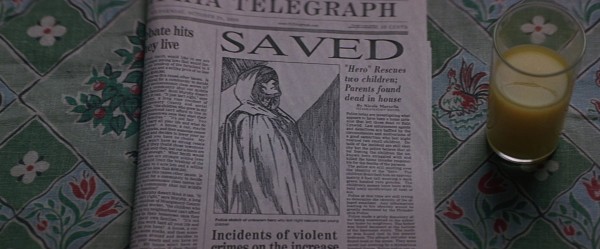
Since a major theme of the film is how the fantastical world of superhero comics are manifesting themselves in the real world, the tilting is ingeniously followed up in the placement of another “cover”. This is the front page of the newspaper towards the film’s end, detailing David’s nocturnal heroic exploits, and the fact that the picture is drawn also fits excellently with the theme. In the epilogue, the same paper is again seen tilted in the same direction:
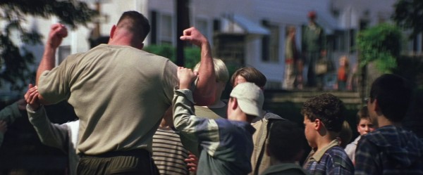
Before we leave the strands emanating from the train scene, we should mention the curious chain set in motion by the young woman. She is a sports agent going to Philadelphia to meet a promising football player. Later, David meets precisely this guy playing football with children in the park. (We understand it is him because Joseph rattles off parts of the same statistics as the woman did.) Even later, we learn that he is the cousin of a boy named Potter who Joseph fought with at school. This in fact creates a nice connection between David and Joseph. The Potter boy is something of a nemesis to Joseph in the film, and the football player is a nemesis to David in the sense that he embodies everything that David has lost, for example the adulation of the kids in the shot below, while David is as usual a passive bystander:
Coherence round-up
Before we start the colour analysis, this chapter will deal with some instances of coherence that did not naturally fit the other chapters. Quite a few have to do with foreshadowing, often of a very short-term nature. (Over the course of these articles, we have already dealt with several items, for example the remarkable handshake foreshadowing discussed in the first article, as well as other issues here, here and here.) One example of this would be Elijah’s glass cane breaking against the subway stairs before he is injured himself. The effect is brilliantly striking but clearly telegraphed. Here we will consider items of a more subtle nature. In the emergency ward, for example, the doctor asks David a series of questions about his general health and all answers are negative – while it fits naturally into the scene, it also prepares us for the fact that David has never been ill.
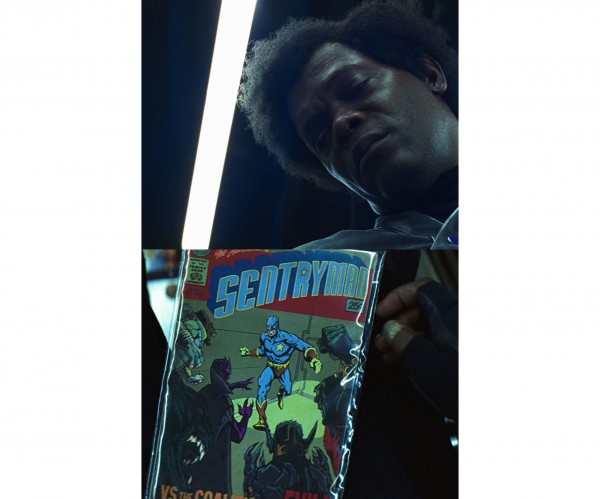
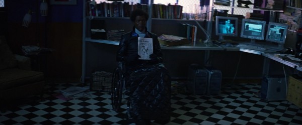
First we shall revisit the second comic book scene and the tilting of heads and comic books, which here will be combined in a rather ingenious way. It seems to me that the tilting of the fluorescent tube over Elijah’s head is meant as another case of local, short-term foreshadowing. It appears to be intentional since his head, starting from an upright position, ends up with the hair exactly touching the edge of the tube, which tilts the same way as the comic books have been doing through the film. From the scene’s surroundings (a comic book shop) we would consciously expect it to be a comic book that Elijah looks at. But with a maniacal attention to detail, Shyamalan seems to want to add another layer of unconscious expectation, to lend an indefinable quality to heighten the moment’s importance:



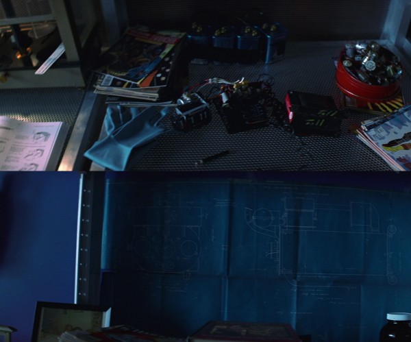
The following items have at least curiosity value:


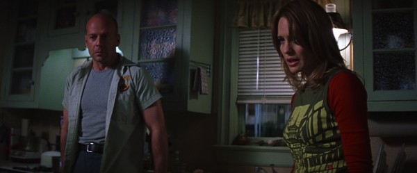

Colours as motifs
Audrey: Rust?
David: Yeah. As a colour, not as rust. You know, like rust-coloured paint or wood.
Audrey: I didn’t know that. (…) Mine’s still brown.
The analysis will look at individual colours, situations where many colours occur together, colour as background threat, colour as undercurrent, colour in the train scene. Finally, the stadium sequence will be analysed in full, with a special focus on blue (and purple). (Curiously, the favourite colours mentioned above are hardly seen with the characters at all.)
But let us start with the most obvious: the perpetrators and the visions they appear in. They are dressed in strong colours standing out from the crowd and when they are seen through David’s visions, other colours are removed except their own attire. (This strategy of course points directly back to The Sixth Sense, with the murderous mother standing out at the funeral in bright red.) All visions are conveyed through a high-angle camera.
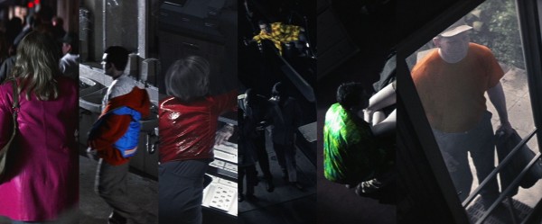

Then for the biggest perpetrator of them all, clad in blue. In all three visions the color placement corresponds with what Elijah is doing:
Individual colours
Yellow: In the first article, we discussed how yellow is attached to Audrey, through the mustard yellow jacket we first see her in, and in particular how the yellow letters spelling “security” on David’s back connects to her. In the flashback scene they both seem to have a lot of yellow in their clothes.
Green: This is closely connected to David throughout, in his clothes and the drenched-in-green train station. The interior walls of his house are in a shade combining green and yellow, as befits a house where David and Audrey live together. The hieroglyphics stela, an ancient forerunner of comic books, is green. There are also a couple of other points of interest. This is from one of the most beautiful scenes in the film:
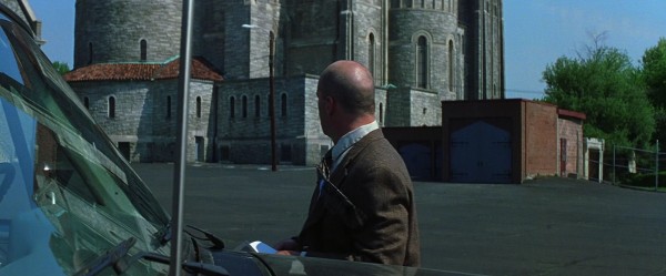

Intentional or not, the green that mysteriously invaded the windshield serves as a bridge to the next scene, which starts with the wardrobe door. It will soon be opened by David, in this shot, where we discussed how the purple framing of the mirror and the green wardrobe tied Elijah and David together, as a forewarning of their future relationship.
Of particular interest is the pivotal moment when David gets Elijah’s phone message, which finally seems to convince David that he might have superpowers:
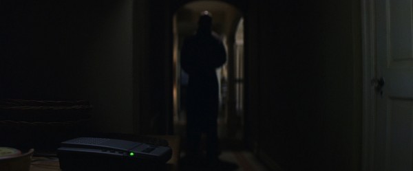

Purple (including violet): [Violet is closely related to purple, and between purple and blue on the colour wheel. I have therefore included it as a proper “Elijah colour”.] The above enlargement of the shoulders is from a few seconds later, so it seems that the purple light is increasing in intensity as the realisation dawns on David. It is very logical in terms of motif that Elijah’s purple colour should “infect” David by shining on him, since the phone message is a key moment in Elijah’s campaign of persuasion. As we discussed in the first article, there can be no doubt that this shot has been specifically set up to achieve the coloured lighting effect. The faintness of the effect says a lot about the level of subtlety Shyamalan is operating on in this film.
It is also interesting to look at the previous scene. As depicted here, David has already taken off his coat, holding it in his hand as he talks to Audrey. Then he puts it on the sofa. He walks to the phone, standing right by it while listening to the first part of the message. Then he takes off his jacket, holds that too in his hand, and walks calmly over to the doorway (arched of course), so the purple light can shine on him. The undressing is probably necessary because the shirt has a colour especially favourable for receiving that purple light. The methodicalness of the undressing creates a pleasing pattern, but is also a metaphor: he is undressing, changing, into a superhero, his true self, for in the next scene he will wear the raincoat, his “superhero outfit”.

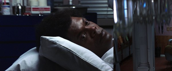
There are a lot of other purple things in Elijah’s life, for example in his clothes. Purple also dominates his birth scene, and there are small purple items both on his desk in his first scene with David, and attached to his wheelchair. On the below comic book cover and the wrapping there are as many as four shades of purple. But there are many other things going on here, so let us briefly go into that:

Blue: Elijah’s other main colour can be found in his clothes (and his buttons in the comics store scene) and many other places. The food plates in the exhibition in the epilogue is so deeply blue that they are almost comical. The fact that the drug dealer played by M. Night Shyamalan himself wears an intensely blue jacket is interesting since his position of master manipulator of the entire Unbreakable creation is a meta-parallel to the scheming Elijah. We will get back to this colour later. Just in passing, a couple of occurrences of some interest:
Colourfulness
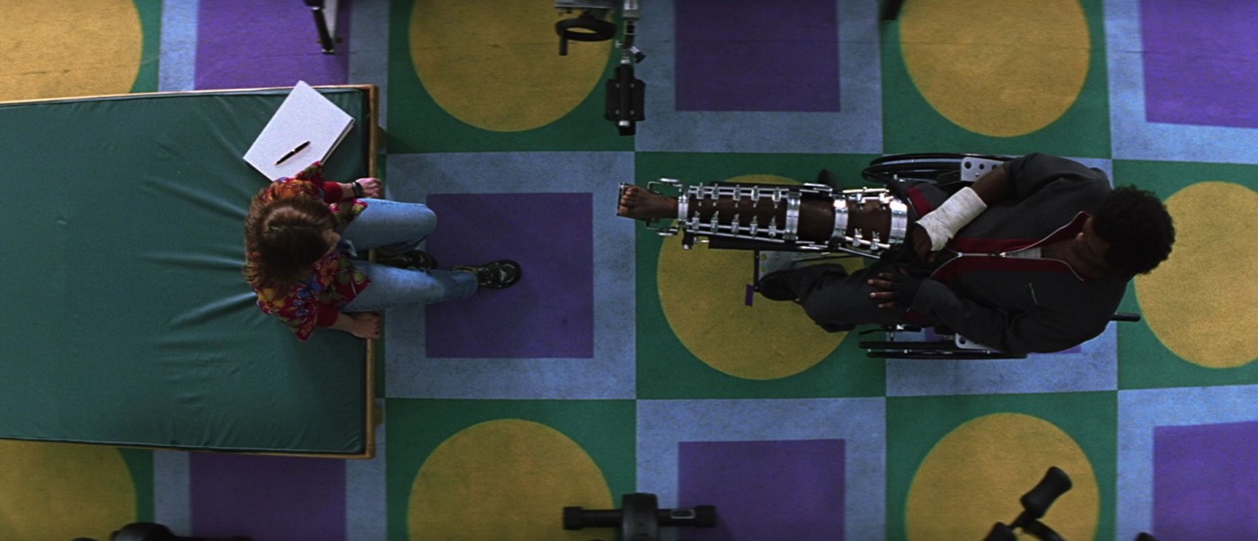
Unbreakable is quite dark and drab-looking, but for a reason, because the careful use of colour, when it comes, has to stand out. But at one point the film explodes in an orgy of colour. Consider the following shot that opens the therapy centre scene (filmed through a plastic pane, it is a bit hazy):
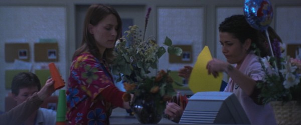

Let us now concentrate on Audrey’s outfit. Its many colours could possibly be meant as a collection of those of the perpetrators. It could also indicate healthiness, being whole. It also connects her to the little girl on the train. Another aspect is that she only wears such an outfit when she meets the comics fanatic Elijah, and comic books are well-known for their gaudy, loud covers. Most of all, perhaps, the colourfulness is something of a smokescreen. The basic colour beneath all the flowers are purple (at least purplish). There are flowers of many colours, but the blue cord on her identity card tips the balance in favour of that colour. The ubiquitous Elijah colours again, then, “infecting” her – he is manipulating her as a means to find out more about David.
The second part of the scene starts with this establishing shot:
Suddenly, Unbreakable looks like a surreal chessboard. The first thing that springs to mind is a certain symmetry: she has her foot on his colour (violet) and he has his foot on hers (yellow). This looks intentionally staged, since her foot sticks out a bit unnaturally. The yellow circle inside a green square could allude to the fact that Audrey and David are couple and in this particular chess game they play on the same team against the prying Elijah. (The bench she sits on is green and yellow too). The violet square inside a blue square is logical since both are Elijah’s colours. It also seems fitting that the only rounded form belongs to the female, and all other colours are male, hard squares.
Colour as background threat
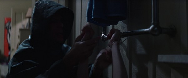
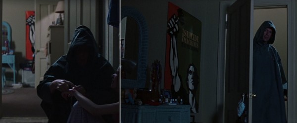
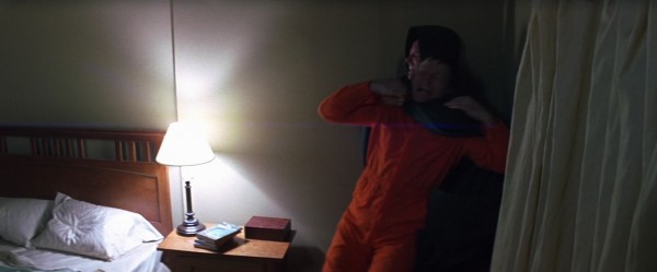
In the sequence when David enters the house invaded by the murderous Orange Man, colour seems to be intentionally used to play on and increase the viewer’s fear that the murderer is lurking in background, ready to attack David at any time. Red and orange are used, for their brightness but they also seem suitable since The Orange Man’s orange coverall is leaning towards the red.


When the colour appears in that last situation, the film music warns of danger, so The Orange Man does not come as a real surprise. The continuous use of the background colour is massaging the viewer’s unconscious, however, “preparing” us for the danger.
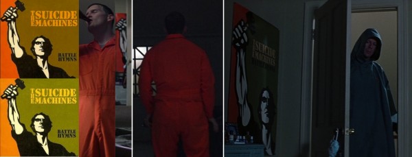
Let us have a look at the background poster again, to try to determine the precision of the colour usage. We got the best look at the poster when David opened the door to the outer room (the rightmost section in the below montage):
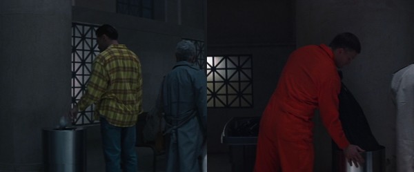
It is for the album Battle Hymns by the rock band The Suicide Machines. On the bottom left is the album cover, with a different shade of orange. There seems to exist another version, however: on the top left is an illustration for a YouYube posting, with a more reddish tone applied over all. But the poster contains yet another combination of shades, and the orange is even more reddish. In fact it seems to be the exactly same shade of orange as on The Orange Man’s coverall. The montage is organised to compare the colours under two different lighting conditions, and the identical nature is best gauged on the one just beside the album covers. So, either the poster has been amended to suit the film, or if there exist several versions in reality, the fact that the filmmakers have chosen as they did still says a lot.
It also becomes clear, below, that when David unties the children, the lighting of the outer room has changed (strictly speaking a continuity error but artistic leniency trumps that) – we are clearly meant to see the poster (as well as the very nice arc-shaped mirror):
Blue and purple as undercurrent
When David dons his superhero raincoat to embark on his adventure, the wheelchair-bound and fragile Elijah is relegated to a passive role in the film. But Shyamalan is able to let him participate in spirit, using flares containing Elijah’s colours of blue and purple. The colours become an undercurrent in the images, and present in virtually every scene.
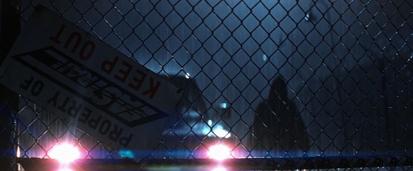

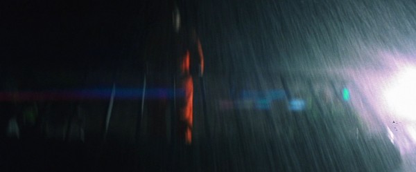


There is also a blue-and-purple flare from a car headlight in the establishing shot outside the comic book store, which Elijah is inside. As with the purple aura around Elijah’s head, all of these coloured flares are possibly a byproduct of an optics effect – on the other hand, directors and cinematographers love lens flares and are known to create them artificially. Anyway, the flares fit so excellently into the film that we cannot ignore them in analysis.
Colour in the train scene
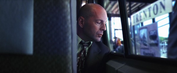
This author is no expert, but like a few other things we have looked at, the colour effects we shall examine below are probably the result of technical camera issues, chromatic aberration for example. But considering the grisly fate of the train and its passengers, and the connection to Elijah, who caused the accident, through his colours, these “problems” again suit the film marvelously. When one gets to notice it, the whole train journey turns into a quite ghostly enterprise, swathed in Elijah’s blue/purple/violet, as the below montage illustrates:



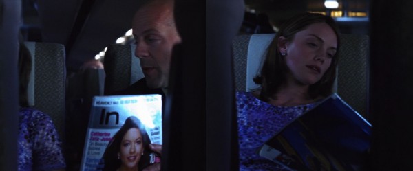
Let us follow the aftermath of the train accident for a bit:


Rhapsody in blue: a look at the stadium sequence
Even though this chapter concentrates on following Elijah’s colours, mainly blue and purple, it will also point out non-colour motifs, to give an impression of how the collected motifs act in concert when watching the film. I will always write blue and purple in bold type when they are present to highlight this analysis aspect. They are only applied in small measures in each shot, so the use seems premeditated and highly controlled.
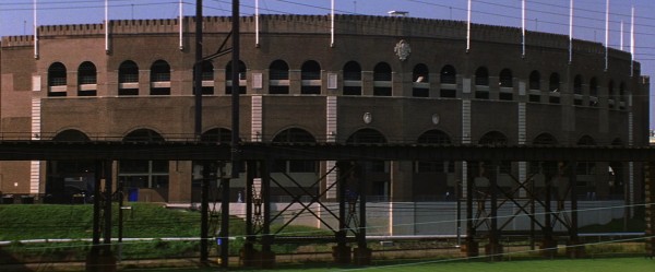


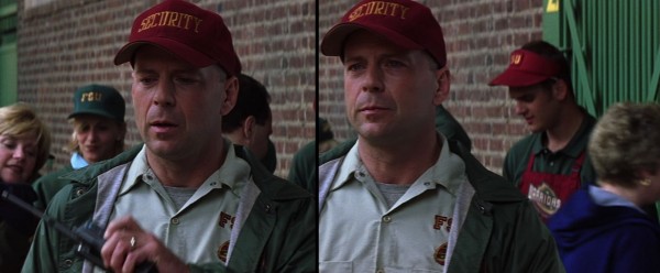


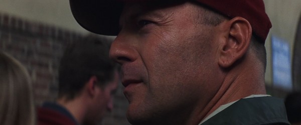


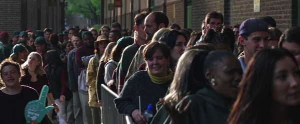

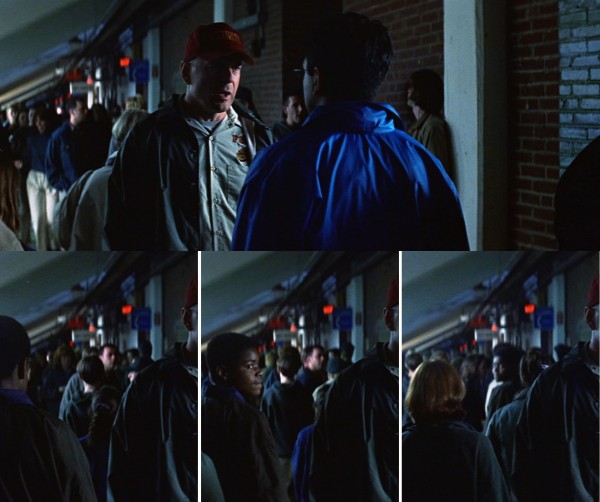
This is exceedingly strange. These are all extras and of course the film crew provide them with props, and it is absolutely conceivable that all water bottles will be of the same brand. But then it ought to be more of them, not this point-precision use, in meaningful ways. And what about the virtual absence of blue from these queue shots, with this amount of people. There are a very few people around with clothes that might be called very bright blue and the boy in the foreground above has a stripe that I guess is some kind of blue. But that is all, and those shades are a far cry from these intensely blue caps. They seem to be intended to be noticed while the extras seem to be told to not wear blue. The caps are also in exactly the same shade as the blue door in the establishing shot, as the thing under the arch and as in a great many shots in this sequence and the rest of the film, specifically connected to Elijah.
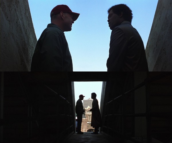
Now for the chase with Elijah and the gunman. Please note that the first article discussed (here) the parallel between the chase and the scene with Elijah as a 13-year-old, and the role of the film music in this. I will not repeat any of those points in the following.
The nature of the previous scene – a static long take, lasting 132 seconds, ending with the camera pulling away very slowly – creates as great a contrast as possible with the next situation, which signals the suspense to come by a fast cutting hardly seen anywhere in Unbreakable so far. The first shot only lasts one second and compared to the film’s overall pace feels like a pistol shot. The abrupt cut to an unfamiliar environment, the peculiar padding inside the car, which in addition turns out to be a vintage model – all of this also add a surreal element to the proceedings.


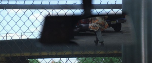
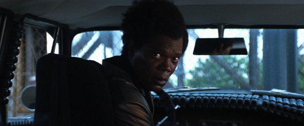
There is a reason that I joined the shots above. To me, there has always been a strange harmony at work here. The visual similarity of the shots seems important. The pattern of the grill (which is arc-shaped by the way) seems to echo the staircase of the bridge. The bridge itself forms a geometrical shape, as does the windshield of the car (as well as the car itself). Both rest on the horizontal lines of the grill and stairs. They occupy roughly the same position in the shots, and are centralised. Each shot respectively features Elijah’s main colours of blue and purple. The blue bridge is framed by Elijah’s car window. It all forms an intricate, intersecting system of placement, colour and motifs, one effect being that the surroundings (bridge, stairs) somehow reflect his inner world, as he sits encased in the car.
At the end of the last shot, Elijah’s brooding is suddenly interrupted. He becomes aware that the gunman is nearby because Elijah hears him coughing. To avoid this seem sudden and contrived, Shyamalan took care to show that when the gunman left the queue, he was coughing. Also, since Elijah was staring in front of himself in a stupor, it was necessary to use sound to rouse him. Not letting us see the gunman at first also lends more urgency, drama and elegance to the scene.


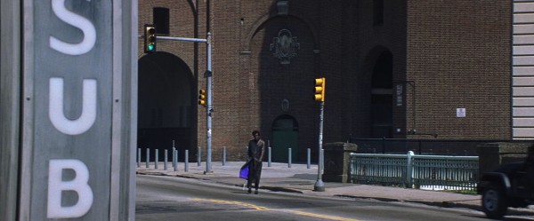

Elijah now sees the gunman below. Let us dwell a bit on this moment and pictorial constellation:
The chaotic criss-crossing lines of Elijah’s shot contrast with the calmness of the shot of gunman, who has the upper hand. The use of long shot only adds to Elijah’s helplessness. Still, like the shot of Elijah’s car, there is a strange harmony here. The symmetry of the compositions, the parallel of the foregrounding of stairs and railing, the mutual long-shot appearance of the characters, and, not least, they are both framed inside squares that appear in very similar positions in the framings. There is an almost mystic connection between the shots and between the characters.


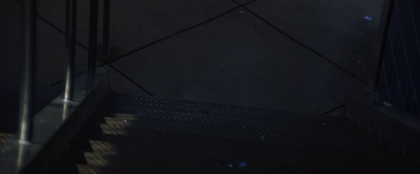

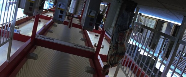

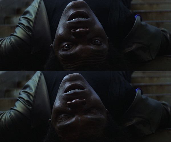
That little bit of blue ties in with the hidden joke we discussed in the preview part of the first article. Shyamalan cuts to the next scene where a bus drives up, with a wheelchair sign in the very same shade of blue. The connection is much more specific than merely alluding to broken bones, however, since in a bit of droll foreshadowing, Elijah will in fact spend the rest of the film in a wheelchair.
In Unbreakable one often has the feeling that everything goes into a system, not a word, gesture or object are wasted in creating meaning, coherence and consistency. In the first article we saw how the actions and properties of the characters created such interconnectedness. In this article we have looked at how the “inanimate” motifs within the shots do the same. In the third article we shall look at how the shot compositions and various formal devices will add yet another layer of meaning to the film.
*
Addendum: The mystery of the orange juice
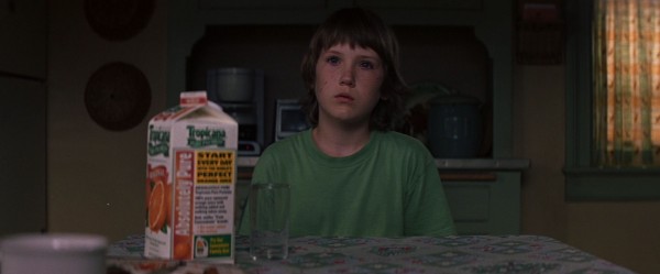
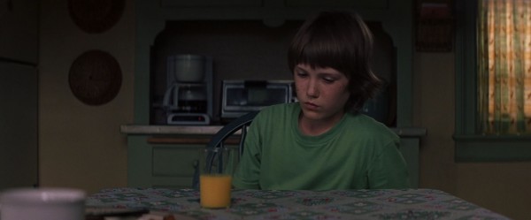
We shall now look at a the film’s penultimate scene. Cinematically it is perhaps the most conventional in the film – its “naturalness” fits its everyday mood, however – but it contains a fascinating device. Our exploration starts just after we left off at one point in the first article, with Joseph on the staircase on his way to the kitchen. He is hearing soft voices, but with an eerie, disembodied ring. Shyamalan connoisseurs cannot avoid thinking about of the first ghost scene in The Sixth Sense, when Cole approaches the kitchen, with strange, impatient sounds of things being moved about coming from it.

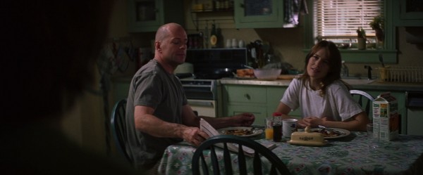
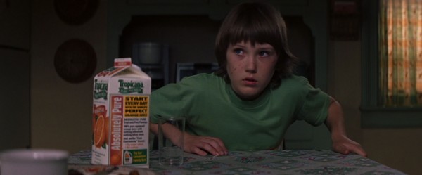
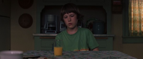
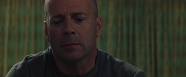
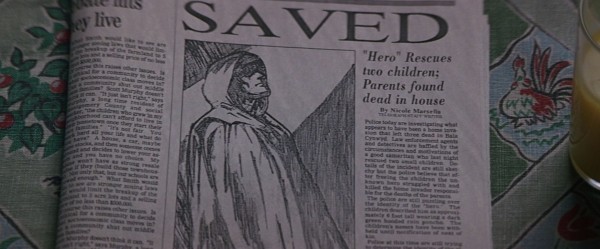
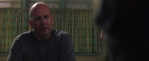

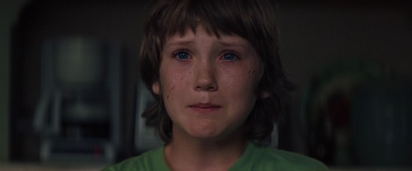
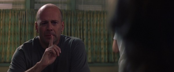

It seems plausible that the disproportionate attention given to the orange juice is a device to estrange this otherwise resolutely everyday scene. Shyamalan creates an undertow of strangeness through something naturally present in the scene, in preparation for the monumental strangeness to come. (What happens in the kitchen basically echoes the film’s theme of introducing the fantastic element of superheroes into an everyday world.)
It is also possible to interpret the specific usage of orange juice and drinking:

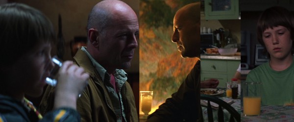
During their meeting with Elijah, David says, “Joseph, don’t take another sip of that water. Go throw it in the trash.” On one level, this is of course an excuse to send Joseph away so he can give Elijah a good talking to in private, but given David’s fear of water, it is amusing that he acts as if the water should be contaminated (like the little girl in Signs!). In fact, in his persuasions Elijah tries to infect David with his ideas, so it is fitting that he should try to “weaken” David, who also has a glass with water in this scene.
In a film about healing, it is also useful to note that in the bar scene with Audrey he is having a yellow drink, Audrey’s colour. By the end of the film, the dreaded water has been exchanged with something “richer”, where in the healing process the yellow acknowledges Audrey’s patient support, and the name of the drink itself connects to the fight with The Orange Man, the glass carefully placed beside the newspaper. In their kitchen communion both David and Joseph have orange juice, but their glasses are half full (Joseph very deliberately stops filling it exactly half-way). Like equal halves of the equation, they complete each other, in mutual healing.
Some other points: In the park scene, when David has discovered that Joseph has broken Audrey’s ban on playing football, Joseph asks him, “Are you gonna tell?” One could say this points forward to the kitchen scene and their decision to keep certain things secret from her. Also, the newspaper culminates a small chain, because David has been keeping a file of clippings: the early ones was about his success in football, then came the car and train accidents – the absence of clippings between the accidents, years apart, is a neat metaphor of the emptiness of his life – so it seems fitting that his big triumph should end up in a paper, even on the front page.
(Did you notice the extensive continuity problems with the newspaper? They are detailed here.)
*
You can find the part I of this analysis here. The third and last article in this series about Unbreakable will be published soon.


